BLOG/News & Press
Invisible Children Store Launch
 Invisible Children stood out as a client for us because they are more than just a simple e-commerce site, their cause is equally, if not more important than their product. We wanted to find a way to marry the two. The user experience of the site was a graceful balance between educating the users about the cause and highlighting their wonderful products. We wanted the users to identify that these products are supporting the cause and realize the impact they were making through a purchase.
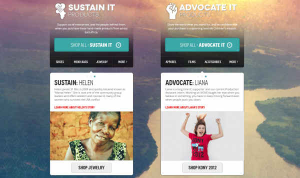
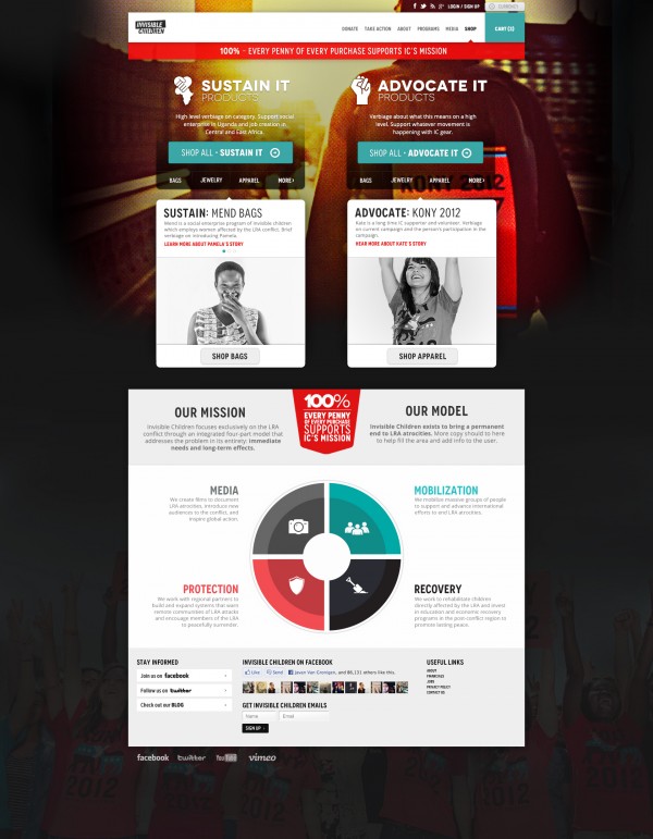
A few challenges we had heading into the project were to effectively communicate what "Advocate It" vs "Sustain It" products were. Advocate it being those products which promote Invisible Children and the charity’s cause, while Sustain It products are made in Africa and raise funds for works in the area. Another challenge in this project was to create a human connection between the user and products, on three different levels.
1. A personal level, to get a one on one connection with the user.
2. A global level to let the user know what they were supporting and how they were impacting.
3. A social level to encourage spreading the word about this product or cause.
Along with these challenges, as with any site design it is important to create a user friendly experience.
View the page below to see our solution or click through to the Invisible Children Shop to navigate the page and while you're at it buy a shirt or two and support the cause!

More from the
DO Blog

Designing & Building Product Finder Quizzes for eCommer...
Strategy & Planning / December 23, 2020
View Blog Post
3 Customer Motivation Strategies to Improve Your eCommerce i...
Strategy & Planning / July 27, 2020
View Blog Post
