BLOG/User Experience
Landing Page Design Audit with TheLadders.com
 [/caption]
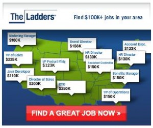
What catches my attention?
- Find $100k+ jobs in your area - Who doesn't want a salary at that level?
- A map of the US - I love my country and this makes it easy to scan.
- Pinpoints listing titles and salary levels - I can browse to a location that interests me plus see sample salary levels. A kind of buffet for finding a new job.
- Find a great job now - A simple call-to-action always tops off great creative.
 [/caption]
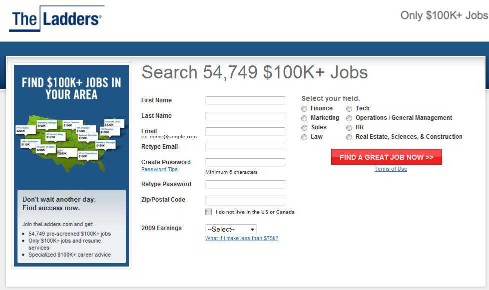
Are MY expectations met as user once I land on this page?
- I can search for 54,749 jobs at $100k+ salary level - Numerical data points add value for users.
- I see the same US map creative I just saw in the ad - consistency is great!
- I can search around my own area - zipcode searches are simple for users.
- I can select my field - filters are good to avoid overwhelming users.
- Form fields - If they're not required, why are they there?
- Personal Information - Why do you need/want my information?
- 54,749 jobs text should be visually different from $100k+ text as it blends together.
- Job categories - why are they on the right? Seems random. Why not follow top to bottom form progression, ending at call-to-action with a button?
 [/caption]
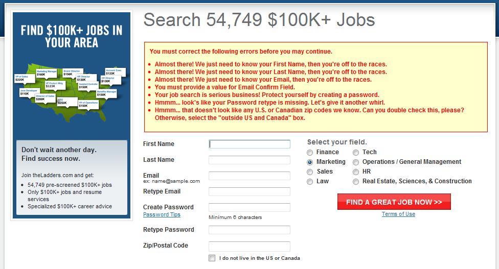
Dear Ladders UX Design Team and Marketing Team,
Please don't show non-required form fields and then display a message like the above. I'm leaving your landing page, you didn't capture any of my information, you left a bad taste in my mouth as a user and I won't see anymore of your ads when I'm browsing.
So some quick lessons and tips for Creating Landing Pages and Meeting Users' Expectations:
- Set expectations - If you tell me I'll be able to do something, then let me do it
- Be consistent with your creative - pull in similar elements to continue that user experience
- Avoid unnecessary form fields - they're an eye sore
- Don't Trick Me - Avoid trying to get users to create accounts covertly - not nice
- Visual Hierarchy is important - separate important data elements, so they stand out to users
- Quick Interaction Points - Make it simple and fast for me to perform the action I intend to
- Smooth Form Flow - Top to bottom is standard, don't get all creative
- Testing - Use a tool like Google Site Optimizer to test creative, messaging and form completion to see what actually works ... this one didn't.
More from the
DO Blog

Designing & Building Product Finder Quizzes for eCommer...
Strategy & Planning / December 23, 2020
View Blog Post
3 Customer Motivation Strategies to Improve Your eCommerce i...
Strategy & Planning / July 27, 2020
View Blog Post
