October 16, 2012
By BJ Cook,
It was Spring of 2012 and 7 Diamonds came to DO for a redesign of their men’s apparel website. They had a few things they wanted to see on the site, but overall they just wanted to freshen things up. Their main objectives included a site that was responsive, which would look great viewed on a monitor as well as a tablet, easy updatability to allow for multiple campaigns throughout the year and a high impact experience through the use of photos and video.
As the UX Specialist, I wanted to share with you some of the challenges, ah-ha moments, and considerations I went through in contributing to the redesign of 7 Diamonds. There were ups and downs but don’t worry kids, it had a happy ending.
Goals: Yes, responsive tiles and designing an overall responsive website is a challenge in itself, but our team wanted to go farther. We wanted to find a happy medium between stunning visual impact, smart functionality and laser sharp usability while also meeting business goals. Most of all we wanted to base all of our design decisions in sound reasoning.
User Goals
We defined two main user types early on: the Browser, who does not know what it wants before it gets to the site; and the Seeker, who is looking for something specific when they get to the site. We wanted to cater to both of these user types when they navigated the website because, after all, it is the user that has the power to make or break the success of a website.
Responsive Tiles 101 – The Homepage:
Old Home Page:
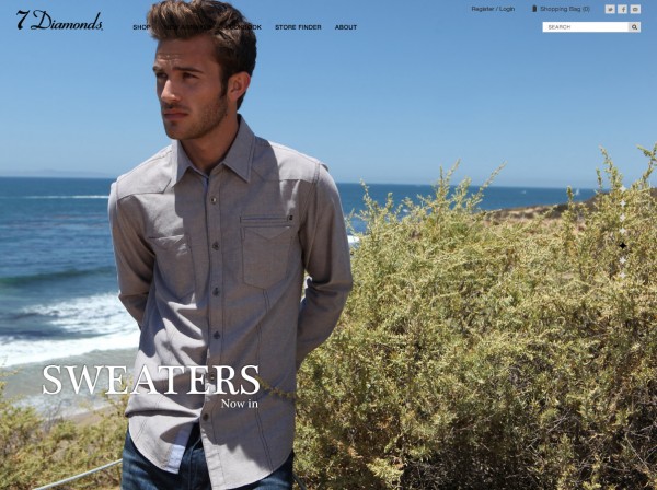 The Problem:
How to create a seamless grid that looks the same on any sized browser without holes or whitespace that lends itself to easily adding and taking away photo blocks. Additionally, the first block of the grid had to be 16:9 to facilitate videos and the grid blocks had to be an array of shapes and sizes in order to establish a versatile, lively arrangement rather than a bland “perfectly symmetrical” grid.
Possible Solutions:
- Perfectly even blocks…perfectly BORING! Next?
- Create 2 - 4 specific grids based on browser size. These grids would be pre-designed in each browser size state. The grid would then be selected based on the closest pre-designed state. This would require extra design time, and would not be scaleable or easily edited. In addition, this option would limit the amount of blocks available in the grid. We passed on this option too.
- Use JQuery Masonry to organize the grid. This plugin is smart enough to rearrange the grid blocks in way that results in the best fit and ultimately the least amount of holes in the grid. For the most part this plugin works fairly effectively but it will never allow for a perfect result. This wasn’t our perfect solution either.
Result:
Our final solution was to build every block of the grid to be the same width. The video block would be double the width of a regular block in order to design with hierarchy in mind. While every block needs to be the same width, the height becomes the spice of life. Consistency in width allowed us to create visual texture, hierarchy and rhythm with the height of each tile. The roll-over movie added to that texture. The only issue to this solution is that when a user scrolls to the very bottom of the page, there will be some uneven whitespace. We were OK with this solution because the white space on the bottom was only visible below the fold and did not affect the overall user experience or hierarchy we were trying to accomplish. The white space or “holes” would never be seen when initially landing on the page, and that’s what matters.
New Home Page:
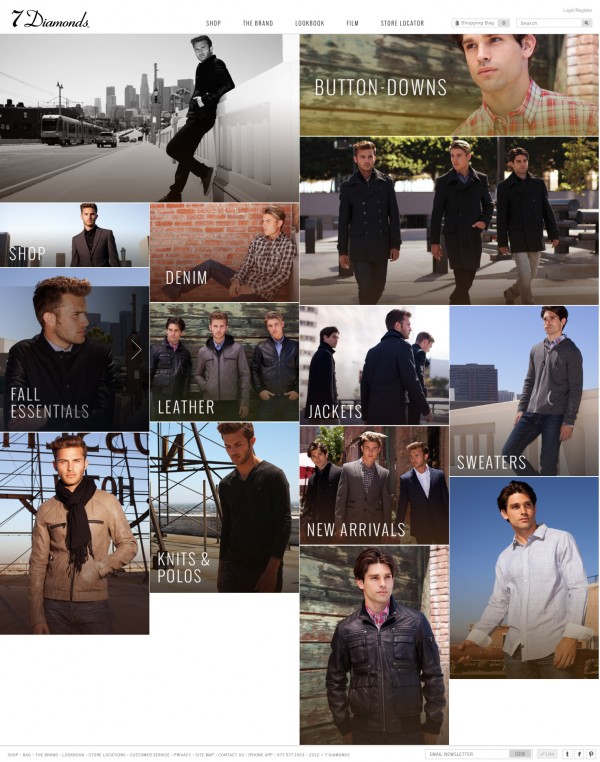

The Shopping Experience
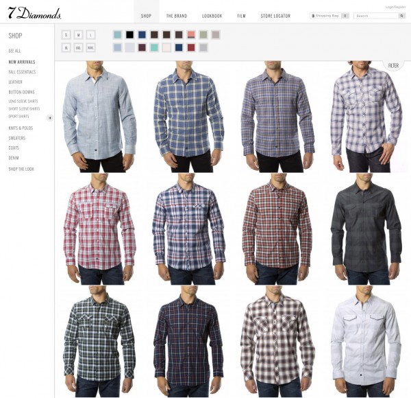
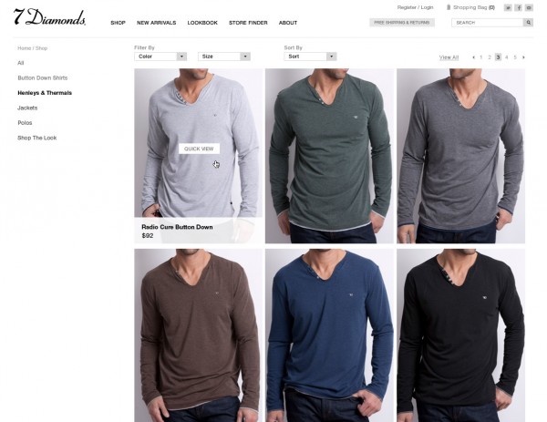
Our goal was to create a shopping experience that lent itself to both easy browsing and impactful imagery with very clean interactions. We wanted to use responsive functionality to make moving through the categories a simplified and quick experience. We achieved this by making the product images a little smaller with the ability to wrap responsively depending on the users screen size. At this point the user is browsing and trying to pick a product. We wanted to facilitate that and we achieved that visual impact by showing a flood of product. To facilitate the “Seeker” user we added a drop-down filter for an effortless shopping experience.
New Category Page:
 Old Category Page:
Product Page
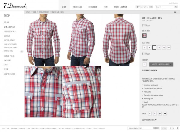
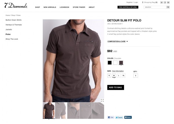
Once the user moves on to the product page, we wanted to keep any purchasing decisions toward the top of the page and make them as clean as possible. In keeping in line with our goal for visual impact and simple interactions, we gave the most space on the page to product photography. If a user did want a magnified view, the photo zoomed to the entire imagery space and took advantage of scrolling functionality to view the whole image. To get out of zoom, the user just clicks the “x”. We felt that this was a great way to highlight the quality and craftsmanship of 7 Diamonds products.
New Product Page:
 Old Product Page:
Shop The Look
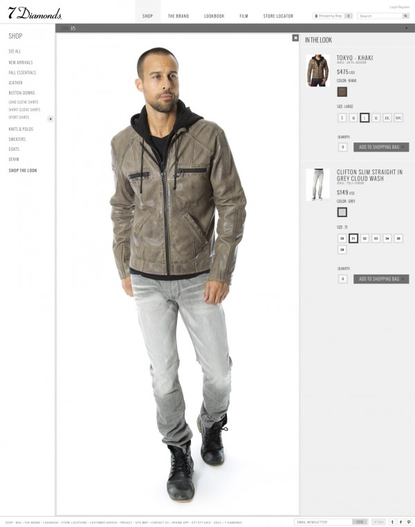
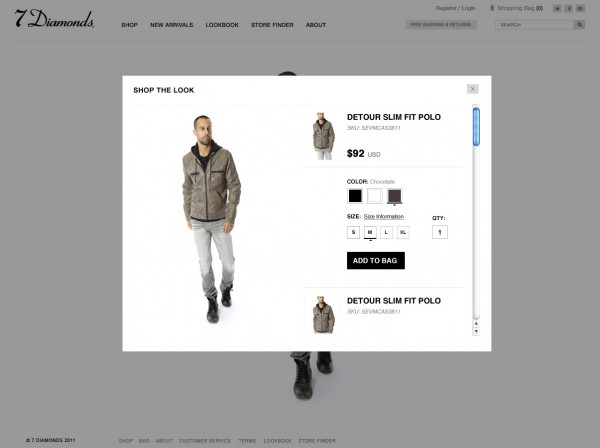
The “Shop The Look” page was another interesting solution to design for. We knew we wanted a carousel of looks for the user to choose from but when a look was clicked on, we wanted to make it clear what products made up the look and to also… you guessed it, show big beautiful photography. We accomplished this by using the product image space that we defined early on to show the look, and the product detail space to show thumbs of the products, as well as a way to quickly purchase.
New Shop the Look Page:
 Old Shop the Look Page:
“The Brand” Page
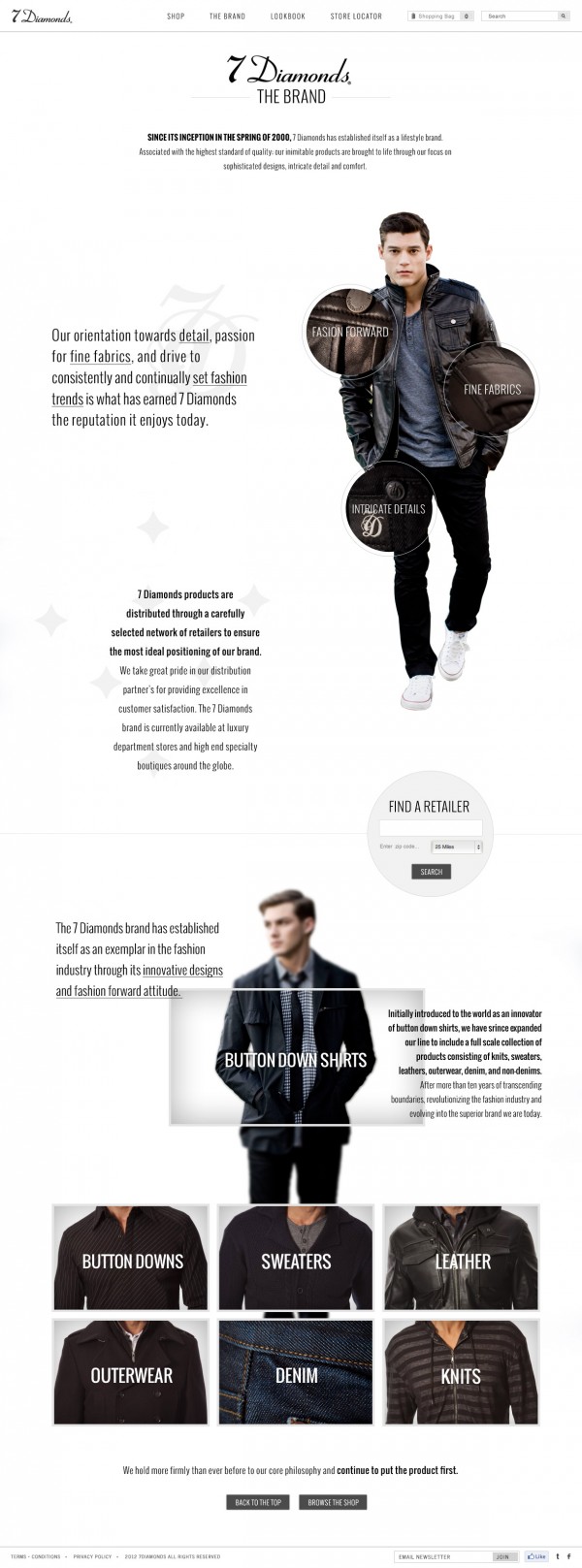
The challenge here was 7Diamonds had only a very limited amount of brand specific resources and at the time, this page was purely text based. The goal was to create an intriguing page that informed the user about the brand in an engaging way. As a result, we created a layered parallax-scrolling page that is visually bold, interesting and informative. It was important to highlight the strongest point of 7Diamonds; the fine fabrics, the intricate details and the fashion forward lifestyle of the brand.
New Brand Page:
 Parallax Tips:
• Heavy and precise communication between the developer and designer is vital.
• Try to design out a couple of stages of movement so the developer has an idea of where objects move and when they move relative to each other. It might be easiest to do this piece by piece. Show specific movements of individual groupings individually rather than trying to show multiple movements in one view.
• Experiment!
• Show the developer other sites that can mimic the type of movement and functionality you are trying to achieve.
Now I told you there would be a happy ending, right? Well, it turns out that some other people thought our design was pretty cool too and we got a few notable nods:
Awwwards Site of the day - September 8
CSS Winner - September 12
CSS Design Awards - September 2
Check out the final product at www.7Diamonds.com
 The Problem:
How to create a seamless grid that looks the same on any sized browser without holes or whitespace that lends itself to easily adding and taking away photo blocks. Additionally, the first block of the grid had to be 16:9 to facilitate videos and the grid blocks had to be an array of shapes and sizes in order to establish a versatile, lively arrangement rather than a bland “perfectly symmetrical” grid.
Possible Solutions:


 Old Category Page:

 Old Product Page:

 Old Shop the Look Page:

 Parallax Tips:
• Heavy and precise communication between the developer and designer is vital.
• Try to design out a couple of stages of movement so the developer has an idea of where objects move and when they move relative to each other. It might be easiest to do this piece by piece. Show specific movements of individual groupings individually rather than trying to show multiple movements in one view.
• Experiment!
• Show the developer other sites that can mimic the type of movement and functionality you are trying to achieve.
Now I told you there would be a happy ending, right? Well, it turns out that some other people thought our design was pretty cool too and we got a few notable nods:
Awwwards Site of the day - September 8
CSS Winner - September 12
CSS Design Awards - September 2
Check out the final product at www.7Diamonds.com