BLOG/User Experience
7 Myths About Product Taxonomies in Ecommerce
Product taxonomies are one of the most common examples of information architecture today— every eCommerce site has one. Taxonomies are also one of the hardest things to do right. And let’s face it, for many, it’s much more fun to create a seasonal campaign or shoot video content than do a taxonomy audit. For all the product taxonomies that exist, perhaps that’s why few people understand what they are — and how bad ones impact the whole UX of your site.
So… What is Taxonomy?
On eCommerce websites, a taxonomy is the structure that products are organized into. To build a taxonomy, you would:
- Define product characteristics
- Group products based on shared characteristics
- Organize those groups into a hierarchy
Each step in this basic process produces an output: the attributes, the categories, and the structure. When you combine those three outputs, you have a basic product taxonomy.
Taxonomies are both conceptual and impactful. Although they will not live directly on your website like a global navigation, they impact many of the most important aspects of defining the user experience including the navigation, product pages, on site search, SEO, and accessibility.
Unfortunately, there is plenty of misinformation out there as to what taxonomies are and why you should care.
Myth 1 -
“It doesn’t matter anymore — people just search”
Browsing to product pages is still very much a part of the customer journey path especially for smaller product catalogs that are less cumbersome to navigate to what you're looking for. Additionally, users are increasingly entering your site from a variety of different channels and entry pages. The element of exploration is still valid for most users given the avg conversion rates may be anywhere from 2 - 10%. For most sites, there is an identifiable ratio between on site search volume and product category pathways.
Clear navigation paths are also insurance against problems with your site search. A motivated customer may not bounce when they get a 404 or useless results in search if there is another option available.
Myth 2 -
“Taxonomy updates have no real impact on users”
So if it doesn’t actually exist on the site, why have a taxonomy strategy at all? Taxonomy influences product categories, product attributes, detail pages, search journey, and back-end organization of your eCommerce site, all critical components of the user journey. Because taxonomy is a higher level look at all of those individual components, it will also streamline your organization methods.
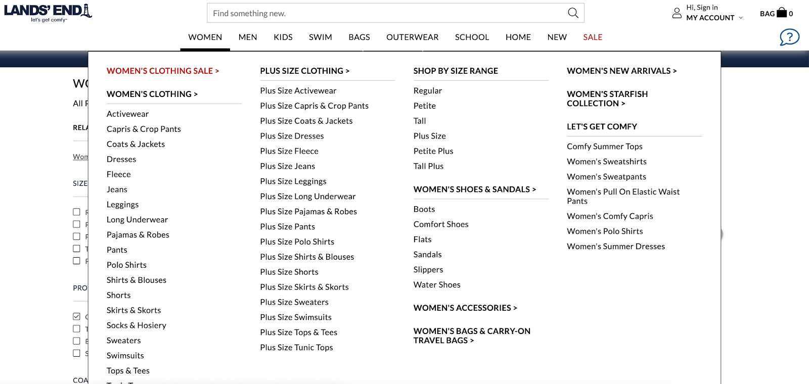
For example, Land’s End offers categories based on clothing type and size range. Once the user selects a category, the first two filters offered are clothing type and size range. This is frustrating for users because they just made that decision, and now will probably be looking for a specific fabric, color, or feature.
A taxonomy audit would reveal duplications like these, and a well-built taxonomy would offer users a better approach to their goals.


Myth 3 -
“We’re taking a ‘bottom-up’ approach to taxonomy, so we’ll do it after we’re done”
Many people claim they are using this valid method to cover up the fact that they are putting off their taxonomy.
Top-down information architectures start with a structure and grow as various items are placed in it. For product taxonomies, this usually means refreshing an existing system. By contrast, bottom-up information architectures start with individual components and build the structures around them. This is the best method for building a new taxonomy.
Because bottom-up workflows require well-formed components, many people insist that taxonomy formation should happen much later in the process. However, wading into the depths of a data migration or rebuild without a framework will result in a disorganized structure. Building a taxonomy “bottom-up” is a valid approach, but you need to have a completed, workable product before you proceed with the rest of the site.
Myth 4 -
“I’ve already completed my navigation, so I’m done!”
Your product taxonomy should not be a 1:1 match with your site navigation.
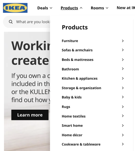
Consider a site like Ikea.com. Like most homegoods and furniture sites, their navigation scheme reflects what room the item will end up in: Kitchen, Living Room, Bathroom, etc. This generally helps their users find what they’re looking for, but it is a poor taxonomy. Does a lamp go in the Living Room, Study, or Bedroom? Is that throw pillow for a couch or a bed? The categories reflect nothing about the products themselves and allow for too many duplications.

Navigations are user-facing components and should be optimized for user expectations. Navs also contain duplicates so that users can find the products they need regardless of how they’re classified.
Taxonomy, however, isn’t user-facing. As we saw from the process, it consists of attributes, categories and hierarchy, and is built around the products’ characteristics, not how people classify them. Taxonomies should also have as few duplications as possible.
Myth 5 -
“There’s a perfect solution for every website”
Large sites like Amazon have such exhaustive catalogs that it’s tempting to copy their solution and go. In reality, each set of users has a unique set of goals, expectations, and pain points. Each solution will be slightly different from the next one, even in the same market.
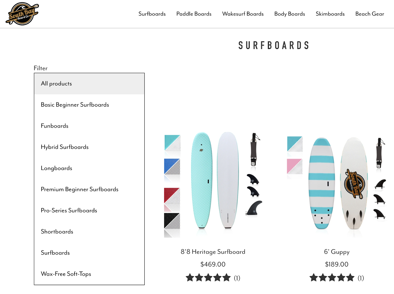
One of the things that makes smaller retailers appealing is the specialization and expertise in certain fields. Compare the product categories of South Bay Board Co. to the surfboard section of Amazon.


Because South Bay Board Co. has an entire vertical of surfboards, the subcategories are thorough and useful. On the other hand, Amazon’s surfboard category only contains two subcategories. South Bay Board Co. has leveraged its expertise in surfing to create a better taxonomy for its products than Amazon’s.
Myth 6 -
“Having our products organized will fix all our problems”
As important as a good product taxonomy is, it is still only one aspect of the overall user experience. No one will bother with your neatly organized products if your content is unreadable, your interactions are distracting, or your site is poorly implemented. Information architecture can’t thrive without support from other UX disciplines.
Myth 7 -
“When we’re done, we’re done”
Like every other aspect of an experience, product taxonomies need evaluation and maintenance.
First, taxonomies should be tested before the project proceeds. Are users navigating through information like we anticipated? Are website admins able to understand the structure and add new products correctly?
Then, throughout the life of the website, it is important to check in on the taxonomy’s growth. Is the taxonomy accommodating new products like we thought? Is this still meeting our customers’ needs? Has the language around our products changed? Are our admins still able to confidently navigate through the back end?
With some occasional maintenance, taxonomies are investments that can stay with you through years of maintenance, even new versions of the website.
More from the
DO Blog

Designing & Building Product Finder Quizzes for eCommer...
Strategy & Planning / December 23, 2020
View Blog Post
3 Customer Motivation Strategies to Improve Your eCommerce i...
Strategy & Planning / July 27, 2020
View Blog Post
